Link styling - Underline your links. Test with night mode. Test in greyscale
Published on May 23, 2023
Summary
Link styling and colors matter if you want your links to be perceived.
Links should be underlined. This is better from a usability perspective as well as from an accessibility perspective.
Links without underline will be harder to perceive for folks with low vision. But they will also be difficult to perceive for color blind folks, as well as those who turn off blue light on their screen (for accessibility or to help with sleep or eye strain).
Default browser styling for links has always been to underline them. This is also an accessibility best practice, and a standards requirement. The Web Content Accessibility Guidelines (WCAG) call for not relying on color alone in Success Criteria 1.4.1 Use of Color.
There is some “wiggle room” which allows for not using an underline. This is explained in one of the success criteria understanding document, Technique G183. It you want to avoid an underline, you must:
- Have more than 3:1 contrast between link text and surrounding text, and
- Display an additional visual clue on hover.
This is actually more difficult than you’d think. Doable, but not straightforward. Because your link text still needs to meet WCAG SC 1.4.3 Contrast (Minimum) which calls for a minimum of 4.5:1 contrast ratio between link text and background.
But it’s not enough to technically meet the standards. You have to make sure your links are still perceivable. There are 2 simple tests you can do to get a feel for this.
Blue Light test
More and more people are aware that blue light has an impact on sleep patterns. They will reduce the amount of blue light emitted by their screens, or even turn it off completely. Other folks need to do this for accessibility because their eyes get fatigued quickly if there’s too much blue light.
To test for this, you can use Night Shift on your Mac, or iPhone. You can also set your display to night time in Windows.
Grey scale test
Many folks with ADHD find screens with lots of colors distracting. They often set their screen to greyscale. This has been a “productivity hack” for a number of years.
Using greyscale is also a good way to determine how easy it will be for color blind folks to use your color scheme.
To test this, you can use color filters in the accessibility options of Windows as well as the accessibility options of MacOS. Similar techniques can be done on iOS and Android mobile devices.
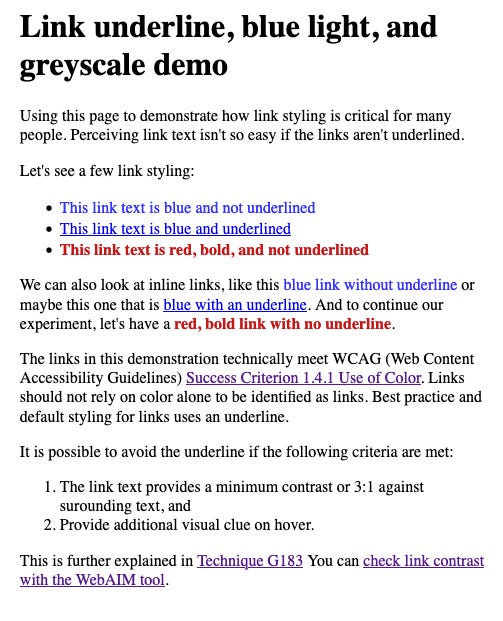
What does it look like?
I created a small Codepen to illustrate this. I used 3 link styles:
- Blue with no underline
- Default browser style
- Red and bold with no underline
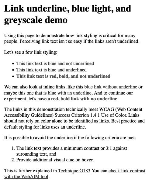
Here’s how it looks when filters are applied to show greyscale:
I can’t show you how it looks using Night Shift on a Mac because the screen capture feature happens at a different GPU level than Night Shift! But it’s fairly straightforward to test it for yourself.
For those of us with typical sight, it becomes difficult to tell the links apart from surrounding text. For those of us with low vision, or color blindness, or prone to eye strain, it becomes next to impossible. Or require additional cognitive load.
So what?
Be kind to your app users and web visitors. Underline your links.