Red means stop
Published on May 22, 2023
Summary
Red text often has negative implications. Be careful when you use it.
Typically, styling text in red indicates an error message. You will confuse your users if you use it with all messages, including success messages.
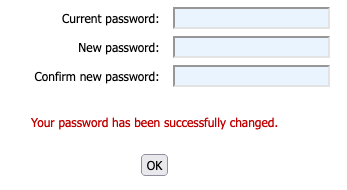
I received the following message when changing my password for a Microsoft-related environment after changing my password.
The text clearly states I successfully changed my password. But because the text was red, I had to focus on the page and really read the sentence.
It wasn’t a huge imposition. But I did have a “WTF” moment. It interrupted my flow.
There are other factors at play. For one, the concept of “don’t use color alone to provide information”. This is covered well in WCAG 1.4.1 Use of Color. Folks who are color blind aren’t likely to benefit from red text - it’ll likely come through as muddy or grey.
How would I change this to make it better?
- Add a large’ish icon before the text. A checkmark for success, or an X for failure.
- And don’t use red for success!